Covid vaccinations if each state was a horse
View Project ↗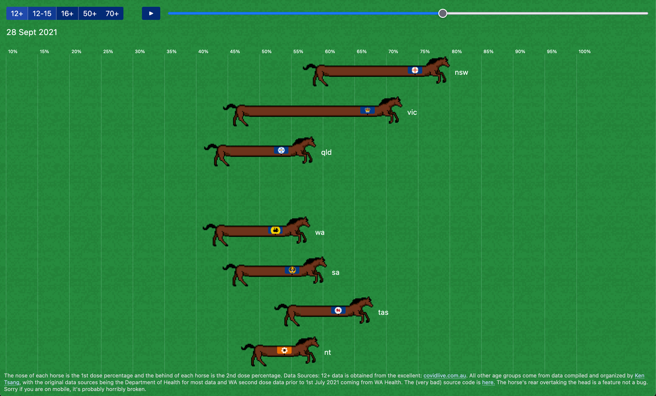
I think most people would agree that COVID has overall been a fairly negative experience for all involved. ★☆☆☆☆ – would not recommend.
One of the slightly more minor negative things to come out of the whole experience was the absolute inundation of numbers, statistics, charts and graphs. In Australia many people had their eyes glued to the daily graphs of the slowly rising vaccination rate, as hitting that magic number meant we would be free once more.
I made this website in an attempt to visualize the data in a more lighthearted way. Does it make it hard to see what the absolute numbers are? sure. Does it break entirely when the 2nd dose percentage gets close to the 1st dose percentage? yup! And is ACT missing entirely from the 12+ view? you bet it is.
Even with all the hackyness and shortcomings it was fun to work on and I think brought an interesting perspective to checking the vaccination rates.